Skybeam

Overview

A B2C mobile chat application tailored for the Gen Z demographic with a focus on location and time relevance functionality.


Problem

The client, while developing Skybeam, has only finished the home page and login process. The client provided more features that they would like to be designed and added to Skybeam as it makes its way towards a finished product. The client also wanted the new features to match the designs that were made for the home page and login process.

Solution

Collaborating with a team of five UX/UI designers we responded to the client's request for additional features. The team and I took the opportunity to design the new screens, including the ability to create posts, access the newsfeed, locate other users, and more. Integrating previous designs and established components, our group effort designed the features that the client provided.

Process

  • Discovery

  • Ideation

  • Design

  • Developer Handoff

  • Reflection

Tools

  • Figma

  • Figjam

  • Miro

  • Google Drive

Duration

3 months

My Role

Sole UX/UI Designer

Discovery

Kickoff

Our team met over Zoom to discuss project goals and design objectives, along with navigating through the various stages of the Skybeam project. To maintain design continuity, we reviewed the existing designs and components and laid out a basic framework for the new features. The client also provided us with the user flows that they wanted Skybeam to follow.

Ideation

〰️

User Flows

〰️

Ideation 〰️ User Flows 〰️

Ideation

User Stories

Our client provided the following user stories as a foundation for the features they want to add to the Skybeam application.

  1. As a user, I want to be able to see the newsfeed.

  2. As a user, I want to be able to create a Beam (post)

  3. As a user, I want to be able to search for other users.

  4. As a user, I want to be able to view other users in my location.

  5. As a user, I want to see my friend list.

User Flows

Our client provided the user flows and stories which each team member then selected a user flow to design. I opted for the "View Other Users in My Location" user flow as it is significant to Skybeam's functionality as a whole. I aimed to provide the user with multiple options to discover others in their location. Taking inspiration from Snapchat, I visualized an interface with a moveable map to show different user locations along with the option of having a convenient list view.

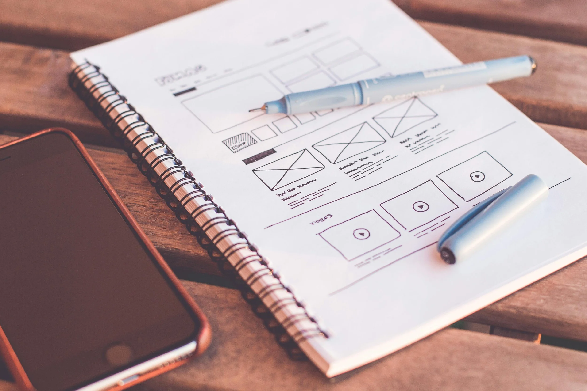
Low/Medium Wireframes

Designing our chosen user flow, I used the existing style guide and components to create new screens customized to each user's journey. The first two screens offer users the flexibility to choose between a map-centric or list view for discovering connections nearby, accommodating individual preferences. For the user profile screen, I focused on ensuring users could easily access key details and information about potential connections.

Design

〰️

Style

〰️

Design 〰️ Style 〰️

Design

UI Inspirations

To get a better understanding of what the client would like Skybeam to be, we looked at other applications for inspiration based on the user flows that the client provided. For example, I found that Snapchat was the perfect application for finding friends and/or connections near the user's location. Snapchat had the unique feature of showing a user's "Bitmoji" along with their location across the world. Uber was also similar in that regard with the exception being that it was drivers instead of friends.

UI Iterations

As a team, we aimed to offer our client a new perspective on the potential of Skybeam. Splitting up into pairs, we crafted our interpretation of the home page, while maintaining the original design. My partner and I opted for a minimalist theme, featuring a sun illuminating the user's profile against a backdrop of clouds framing new chat posts. Additionally, we enhanced the Skybeam name by placing it beneath the logo for a standout effect.

Hi-Fidelity Wireframes

Upon receiving approval for the wireframe designs from our client, we transitioned into developing high-fidelity wireframes for our selected user flow. My emphasis during this phase was on elevating the user experience while adhering to the established design choices. Using the provided color palette, I highlighted information that would be crucial to the user flow. In the map-centric screen, I introduced location markers, each featuring the profile picture of a connection. The list view maintained the same thematic approach, with the only deviation being the inclusion of distance information, providing users with a clear sense of proximity to their connections.

Style Guide and Components

Although the client had a style guide and components, the introduction of new screens necessitated the incorporation of additional components. Specifically, for my user flow, which involved a map-centric view screen, I integrated more icons and components. The emphasis on maintaining an updated style guide ensures a more straightforward collaboration for future designers and the development team working on the project.

Develop

〰️

Develop 〰️

Developer Handoff

Developer Handoff

As the project came to a close, we focused on the developer handoff for the screens that we created. Ensuring that the development team can translate our design vision into reality for Skybeam, nothing needs to be lost in translation. From the measurements to the annotations, I ensured that not a single detail was left out and added extra information that would help the development team have a smoother coding experience.

Reflection

This project emphasized the impact of effective communication, which showed remarkable results. The seamless collaboration among fellow designers contributed to the project's overall success, satisfying the client thoroughly. Since this was a B2C mobile application, I was presented with the unique challenge of understanding the target audience. Being a member of Gen Z, I connected on a personal level to the project, enabling me to envision designs that would align with the client's preferences. Leveraging my proficiency in Figma, I experimented with diverse components, testing color linear patterns to enhance the overall design experience. Given the opportunity, I would enhance some of the features that my team and I introduced to Skybeam. For example, I would want to go further into developing a more in-depth user profile. Profiles can increase user engagement by creating a more personalized experience for the user to connect with other users and find content more aligned with their interests. This would allow Skybeam to increase user sign-ups and gain a more broader target audience.

Explore Further