Zannana

Overview

Zannana is a B2C2C mobile-based application that allows users to host and join nearby tabletop/board games.


Problem

Our client launched Zannana, a company facilitating users to host and join tabletop/board games nearby. However, Zannana had no previous designs and was being designed from scratch. The client wanted users to be able to create an account, chat with other users, and request and locate games to join.

Solution

Our team initiated the groundwork for the mobile application by envisioning and crafting the features aligned with the client's vision. We conducted research and analysis on competitors along with creating UI iterations and designing wireframes to ensure the app's design met both user expectations and market standards.

Process

  • Discovery

  • Ideation

  • Design

  • Developer Handoff

  • Reflection

Tools

  • Figma

  • Figjam

  • Slack

  • Zoom

  • Google Drive

Duration

6 months

My Role

UX/UI Designer on a team of 5

Discovery

Kickoff

The team held its first Zoom meeting to begin planning out the stages of the project. We became familiar with the goal of the project along with looking over some partial designs of what the client would want the project to look like. The client not only shared images but also recorded a video to elaborate on their vision for Zannana and provide insights into how they envision the app's functionality.

Questions for the Client

Since this project was starting from the ground up, it was imperative to fully understand the client's intentions and the direction in which they wanted Zannana to go. This prompted us to create a series of questions related to the design approach for Zannana. The questions covered aspects such as the desired color scheme/palettes, target demographics, and how users should perceive their experience with Zannana. Some of the questions included:

  • Which demographics you would like to capture about the user?

  • Are there any specific event details that you would like to be added?

  • How would you want users to describe Zannana?

The client emphasized a diverse user demographic spanning from 16 to 85 years old for Zannana. In response, they also requested the inclusion of detailed event information such as food, entertainment, and types of games. The client's goal is to ensure Zannana remains a user-friendly and safe application, providing a comfortable experience for users.

Competitive Analysis

During the project kickoff, our client expressed an appreciation for the UI designs of Airbnb and Eventbrite, citing their similarity to the concepts of Zannana. We then conducted a competitive analysis that not only included Airbnb and Eventbrite but also delved into platforms like Rollforgame and Meetup. I chose Rollforgame as my part of the competitive analysis. Some of the key takeaways from the analysis provided valuable insights that influenced our design decisions and strategy moving forward.

  • Airbnb and Eventbrite both had clean UI designs that were both user-friendly and engaging to users.

  • The target market for all four applications was similar to Zannana and was clear in what they were offering.

  • All four applications also had similar features; Find/Search, Profile, Filter, Navigation bar, etc.

Heuristic Evaluation

The client provided us with a design sketch outlining the basic flow of the mobile application. Eager to enhance user experience, our team engaged in the process of conducting a heuristic evaluation of the client's designs. This method not only enabled us to identify potential user usability issues but also allowed us to detect any elements that might pose challenges in the future development stages, ensuring a more refined and user-friendly product. I along with my team worked on detailing the different aspects that the basic flow lacked along with some functions that we incorporated into the final design.

Ideation

〰️

User Flows

〰️

Ideation 〰️ User Flows 〰️

Ideation

User Stories

Our client came prepared with specific user stories in mind during the creation of Zannana, and the intention was for these user stories to form the foundational framework for the mobile application.

  1. As a user, I want to be able to create an account and log in.

  2. As a user, I want to see available events nearby.

  3. As a user, I want to be able to request to join an event.

  4. As a user, I want to be able to communicate with other users.

User Flows

Upon receiving the client's provided user flows, our team collaborated to work on the user flows. I chose the "Request to Join an Event" user flow. I approached the design by placing myself in the user's perspective. My focus was on crafting a straightforward easy to understand experience. Users can browse through events, accessing detailed information before registering—an approach aimed at enhancing simplicity and user-friendly interactions. Given that Zannana is centered around hosting and joining local events for board games and tabletop games, this user flow is crucial to the function of Zannana.

Low/Medium Wireframes

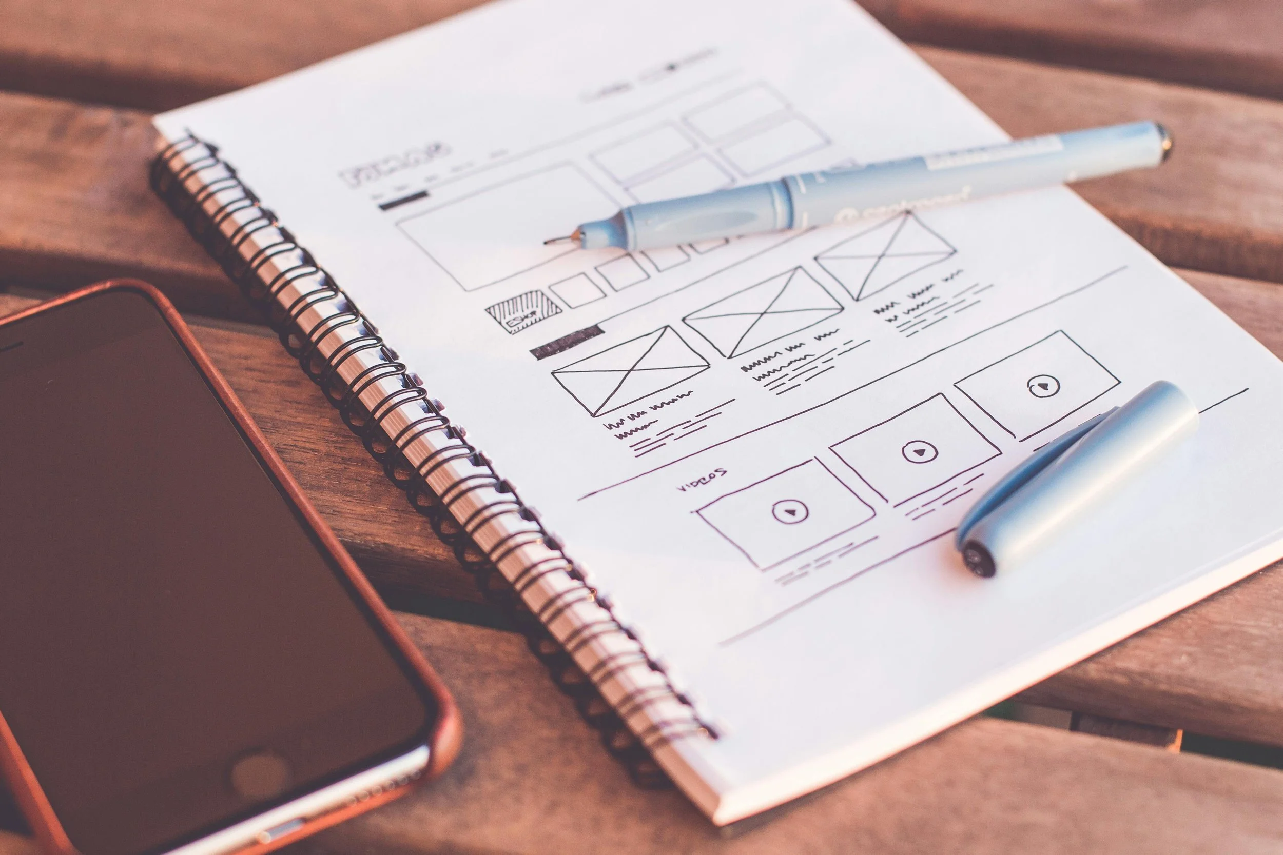
As a team, we designed our wireframes according to our chosen user flows. Maintaining close communication, we ensured that our designs remained consistent with each other and the project as a whole. Given that it was the first phase, we explored different creative possibilities. Our team placed a strong emphasis on refining the usability and overall user experience of the screens, tackling the challenge of presenting a substantial amount of information in a coherent and user-friendly manner. This sparked diverse ideas as we navigated different screen layouts, making the exploration of solutions an engaging and dynamic part of the design process.

Design

〰️

Style

〰️

Design 〰️ Style 〰️

Design

UI Iterations

Our team opted for a collaborative approach where each member took ownership of the UI iteration for the home page. This strategy aimed to offer the client a range of options, serving as the start to the high-fidelity wireframes and establishing the design direction for the entire project. In my UI iteration, simplicity was the focus for the home page. Users can effortlessly scroll through upcoming events and access details at a glance without entering each event, including the option to view past events. This approach aims to streamline the user experience and provide quick access to essential information.

Hi-Fidelity Wireframes

Upon receiving approval for the wireframe designs from our client, we transitioned into developing high-fidelity wireframes for our selected user flow. My emphasis during this phase was on elevating the user experience while adhering to the established design choices. Using the provided color palette, I highlighted information that would be crucial to the user flow. In the map-centric screen, I introduced location markers, each featuring the profile picture of a connection. The list view maintained the same thematic approach, with the only deviation being the inclusion of distance information, providing users with a clear sense of proximity to their connections.

Style Guide and Components

At the start of this project, there was a lack of an existing style guide or components. Recognizing the importance of a consistent design language, we took the initiative to develop a comprehensive set of components, including various color styles, headers, and text styles. Given the client's logo and specified color preferences, we explored various font options, component styles, and color variations to find the most fitting and aesthetically pleasing combinations for the app. This not only laid the foundation for our current project but also served as a reference point for future design iterations, emphasizing the important role of having a well-defined framework for the mobile application.

Develop

〰️

Develop 〰️

Developer Handoff

Developer Handoff

After multiple rounds of edits and fine-tuning, we seamlessly transitioned into the developer handoff phase. Employing Figma's Measure plugin played a key role in facilitating this process. Like the user stories and wireframes, we each did our measurements and annotations for the screens that we designed. With precise measurements and clear annotations, the plugin not only expedited the handoff but also empowered the development team with a comprehensive understanding of our design, ensuring a smooth translation of our vision into a tangible product.

Reflection

In this project, I had the opportunity to infuse my creativity and passion for games into a mobile application. Being able to design a B2C2C mobile application was intriguing as we embarked on the exciting journey of conceptualizing and designing the initial components of the app, which holds a unique style rarely seen in the current app landscape, particularly in the realm of hosting board game activities. In the future, I would love to add more features that would foster stronger connections among users. Creating user profiles would provide a platform for users to connect both in-person and virtually. Additionally, the inclusion of social media links in profiles could further enhance user interaction and contribute to increased onboarding and traffic for Zannana. Bringing this client project from imaginative inception to tangible realization was a particularly special and rewarding experience.

Explore Further